PepsiCo’s Corporate Rebrand 2025: Strategy Behind the New Identity
Updated on
Published on
PepsiCo’s corporate rebrand is positioned as a company-wide transformation signal, not a cosmetic tweak. Official communications frame the move as connecting modernization, consumer-centricity, and the pep+ sustainability agenda to a clearer, enterprise-level story that stretches beyond a single beverage icon (PepsiCo Newsroom). Trade coverage emphasizes that this is PepsiCo’s first full parent-brand rethink in roughly a quarter century, designed to broaden what the masterbrand stands for and to house hundreds of brands under one purpose without echoing the Pepsi globe (Marketing Dive) (Fast Company).
- Strategic aim: move the corporate narrative from “the company behind Pepsi” to “a modern house of food and beverage leadership.”
- Practical read: give investors, partners, and regulators a clearer owner story while keeping product brands culturally loud.
PepsiCo’s new corporate brand identity
- What launched: A parent-level rebrand with a new wordmark and emblem, positioned as a symbol of company-wide transformation under pep+ (PepsiCo Newsroom).
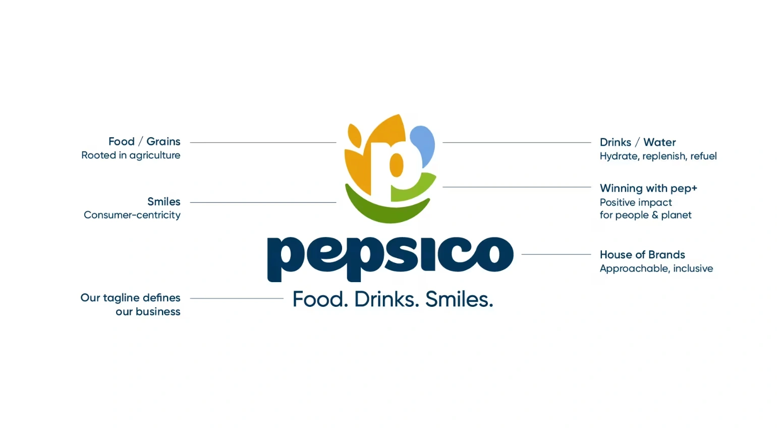
- Emblem meaning: A white P within a circle, flanked by abstract cues for food, water, sustainability, set over a smile-like slash and the line “Food. Drinks. Smiles.” (Marketing Dive).
- Not the Pepsi logo: Separate from the 2023 Pepsi consumer logo refresh; this is the PepsiCo corporate system used across enterprise touchpoints.
- Colour approach: Neutral, high-contrast corporate palette that lets Lay’s, Gatorade, Pepsi, and others retain their native colours in co-branded frames (PepsiCo Newsroom).
- Type and layout: Modern, highly legible typography and modular components so investor decks, ESG reports, and newsroom pages read cleanly at any size (Fast Company).
- Motion language: Measured animations for charts, labels, and lower-thirds to feel current without competing with consumer brands (PepsiCo Newsroom).
- House-of-brands fit: Lock-ups and spacing rules that host hundreds of portfolio marks in one coherent system without dilution (DesignRush).
Positioning shift: from product halo to enterprise promise
The new corporate emblem and line “Food. Drinks. Smiles.” are built to communicate scale, stewardship, and optimism at the parent level, not to borrow recognition from the Pepsi beverage mark. By centering a white “P” within a circular device that nods to food, water, and sustainability, PepsiCo reframes itself as the orchestrator of a diversified portfolio with responsibilities that extend beyond brand campaigns (Marketing Dive) (PepsiCo Newsroom).
- Strategy: articulate a corporate promise broad enough to cover snacks, drinks, R&D, supply chain, and ESG without diluting product equities.
- Outcome: a master narrative that unlocks new conversations: innovation, water stewardship, packaging, nutrition, at enterprise scale.
Clear separation from the Pepsi (consumer) refresh
Pepsi’s 2023 consumer logo update modernized the beverage brand’s own equity system. The 2025 move is explicitly corporate: an identity for investor days, policy dialogue, multi-brand stories, and global corporate channels. Keeping these lanes distinct avoids a brand architecture blur and prevents the corporate parent from being visually subsumed by its most famous product brand (Fast Company).
- Strategy: two identities, two jobs: consumer Pepsi drives category theatre; corporate PepsiCo drives enterprise credibility.
- Signal: investors and institutional audiences get a modern corporate face that does not feel like a Pepsi ad.

Portfolio coherence: one roof for hundreds of brands
PepsiCo’s challenge is orchestration at scale: Lay’s, Gatorade, Quaker, Tostitos, SodaStream, Pepsi, and regional stars must coexist in joint narratives, policy updates, and B2B moments. The rebrand’s role is to connect a dispersed portfolio under a shared purpose while letting category codes stay vivid at the edge. Coverage repeatedly frames the identity as connective tissue across “hundreds of brands” and global markets (DesignRush) (PepsiCo Newsroom).
- Strategy: masterbrand coherence that travels across markets, formats, and policy contexts without flattening local or category equity.
- Benefit: simpler multi-logo storytelling with fewer frictions for partners and press.
.webp)
Corporate voice for modern stakeholders
The strategic bet is that a contemporary corporate identity will raise credibility with non-consumer audiences: investors, policymakers, NGOs, enterprise customers, and talent, who evaluate on governance, innovation pipelines, and ESG progress as much as on Super Bowl scale. The newsroom positioning ties the identity to modernization and consumer-centricity, signaling that the corporate center has an agenda beyond earnings slides (PepsiCo Newsroom).
- Why this matters: corporate reputation increasingly drives license to operate, M&A headroom, and talent flows.
- Strategic lens: make the parent legible in serious rooms while product brands keep cultural heat.
ESG and pep+: from initiative to identity
PepsiCo links the new look to pep+, its sustainability program, framing the brand as a vehicle for long-horizon commitments on water, agriculture, packaging, and emissions. The identity’s symbolism—food and water around the “P,” the upward smile-slash—makes ESG part of the corporate promise rather than a sidebar, which is consistent with how large multinationals now use brand to carry climate and stewardship narratives (PepsiCo Newsroom) (Fast Company).
- Strategy: elevate pep+ from program to front-of-house story, backed by enterprise reporting.
- Effect: clearer through-line between purpose claims, capital allocation, and product-level changes.

Timing context: a 25-year reset for a diversified era
Trades cast this as the first parent-level overhaul in about 25 years—timed to a moment when PepsiCo’s revenue mix, global footprint, and policy exposure look very different from the early 2000s. The refresh meets a world where corporate brands speak daily across digital surfaces, regulators scrutinize more closely, and supply-chain resilience is a reputational factor, not just an ops KPI (Marketing Dive) (Fast Company).
- Strategic logic: align the corporate story with today’s stakeholders and channels, not yesterday’s ad cycles.
- External read: the parent is future-proofing its narrative as business lines and expectations expand.
Global scalability: consistency without sameness
A corporate identity must work from Davos panels to LATAM retailer summits to APAC policy roundtables. The strategy is to codify a recognizable corporate face that can scale across regions and categories without erasing local expression. The launch framing highlights simplification and modernization as levers for global consistency, which is how masterbrands reduce friction for regional teams (PepsiCo Newsroom) (DesignRush).
- Strategy: recognizable corporate codes that travel, local brand voices that flex.
- Benefit: faster alignment with fewer exceptions when multiple portfolios share a stage.

Competitive signaling: beyond “beverage company” optics
By decoupling corporate PepsiCo from consumer Pepsi aesthetics, the enterprise can credibly talk health, reformulation, AI/data, logistics, and sustainability without the conversation defaulting to a soda logo. Analysts and design press both point to the need for a broader, healthier-sounding corporate story that captures where growth and scrutiny are headed (Fast Company) (Marketing Dive).
- Competitive edge: a brand frame that supports innovation narratives in snacks, hydration, and better-for-you adjacencies.
- Risk managed: avoid letting a single hero product define the parent’s public meaning.
-1.webp)
FAQ
Is this the same as Pepsi’s 2023 logo refresh?
No. Pepsi’s 2023 update was the consumer beverage mark. The 2025 move is the corporate PepsiCo identity for enterprise storytelling, multi-brand contexts, and stakeholder communications.
What does the new emblem signal strategically?
A masterbrand promise: food, drinks, smiles, wrapped around responsibility themes like water and sustainability, designed to house the whole portfolio and carry ESG narratives credibly.
Why undertake a parent-brand overhaul now?
To modernize the corporate story for regulators, investors, partners, and talent, and to unify hundreds of brands under one scalable purpose after ~25 years without a full corporate rethink.
How does this affect portfolio brands?
It clarifies roles: product brands keep cultural drama; the parent supplies coherence and credibility in multi-brand, policy, and B2B contexts.
Where will the strategy be most visible?
Corporate channels with high scrutiny and stakeholder overlap: newsroom, investor/ESG narratives, policy forums, trade partnerships, and employer reputation, areas explicitly highlighted in the launch rationale.
A Clearer Face for a Bigger Company
PepsiCo’s corporate rebrand is a strategic redefinition of who speaks for the enterprise and what that voice can credibly carry. By separating corporate PepsiCo from the Pepsi beverage identity, anchoring the story in “Food. Drinks. Smiles.”, and linking the mark to pep+ and portfolio breadth, the company sets up a masterbrand that can handle policy, sustainability, innovation, and multi-brand storytelling without visual confusion. In short, the parent steps forward as host while the brands keep the spotlight, exactly the balance a modern house of brands needs.


