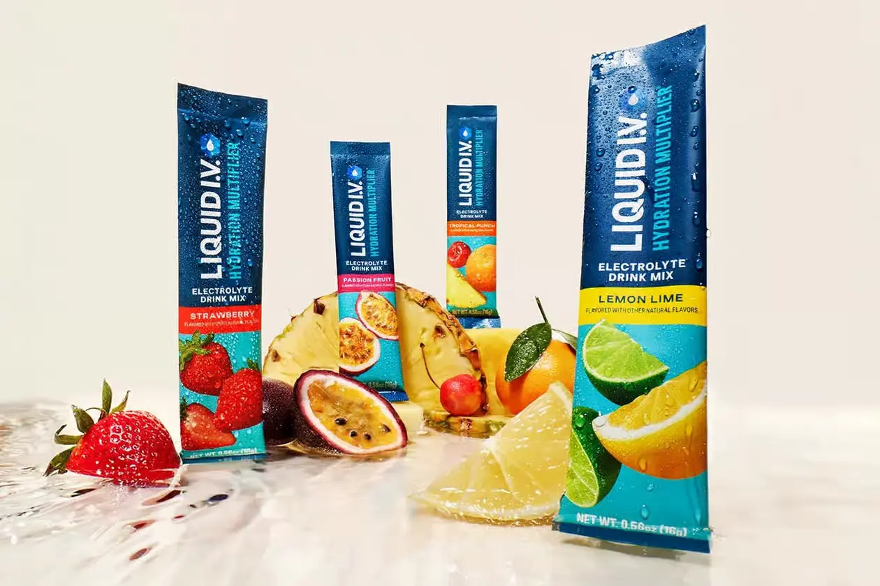
Liquid I.V.'s 2024 brand refresh was the company's first major identity update, but it was not tied to a new owner. Unilever acquired Liquid I.V. in October 2020, nearly four years before the refresh launched. In 2024, Liquid I.V. focused on modernizing how the brand looked and communicated on shelf while keeping the underlying hydration formulas familiar to existing customers.
The result is a useful example of a mature brand updating its visual identity without abandoning the assets people already recognize.

What Changed in Liquid I.V.'s 2024 Brand Refresh
Liquid I.V. updated its two-toned hexagon logo, introduced a bolder type treatment, strengthened its color system, and brought more prominent fruit imagery onto the packaging. The brand also reorganized packaging around clearer functional benefits and flavor cues. In its own explanation of the refresh, Liquid I.V. emphasized that the formulas remained consistent while the outside changed.
The packaging work also addressed a practical retail problem. Powdered hydration products compete in a dense category where shoppers need to identify the brand, flavor, and product benefit quickly. Larger typography, stronger color blocks, clearer fruit cues, and a more visible benefits hierarchy give each stick and multipack more work to do before a shopper ever reads the finer details. The design update therefore serves both recognition and navigation, not just aesthetics. It also gives the growing product portfolio a clearer system for distinguishing flavors and benefit-led variants without making the shelf feel fragmented.
That distinction makes this closer to a brand refresh than a full rebrand. The recognizable logo structure, product promise, and category position stayed intact, while the packaging system became easier to scan and more expressive at retail.
How the Refresh Extended Beyond Packaging
The identity update launched alongside Liquid I.V.'s 2024 summer campaign, "Tear. Pour. Live. More." The campaign's hero film used an exaggerated scene of hikers propelled by water-powered rocket boots to translate hydration into movement and energy. Liquid I.V.'s launch announcement also connected the campaign to activations at Neon Carnival, the Formula 1 Crypto.com Miami Grand Prix, Governors Ball, Bonnaroo, and Lollapalooza.
That broader rollout matters because the refresh was not limited to a new logo file. Packaging, merchandising, advertising, events, and product launches were designed to reinforce the same updated brand system. This created continuity between what shoppers saw in a store and what they encountered through campaign media and live activations, which is especially important when a brand is expanding beyond its original early-adopter audience.
For another beverage example where packaging and positioning work together, Brand Vision's Vitaminwater branding breakdown shows how shelf communication can become part of the marketing itself.
The strongest lesson from Liquid I.V.'s refresh is restraint. The company modernized the parts of the identity that needed more clarity and shelf impact while preserving the recognition it had already built. That is often more valuable than treating every brand update as a complete reinvention.



%2520(1).png)