
How Strategic Branding and UX Design Helped a Tech Startup Build Trust in a Conservative Market
Updated on
Published on
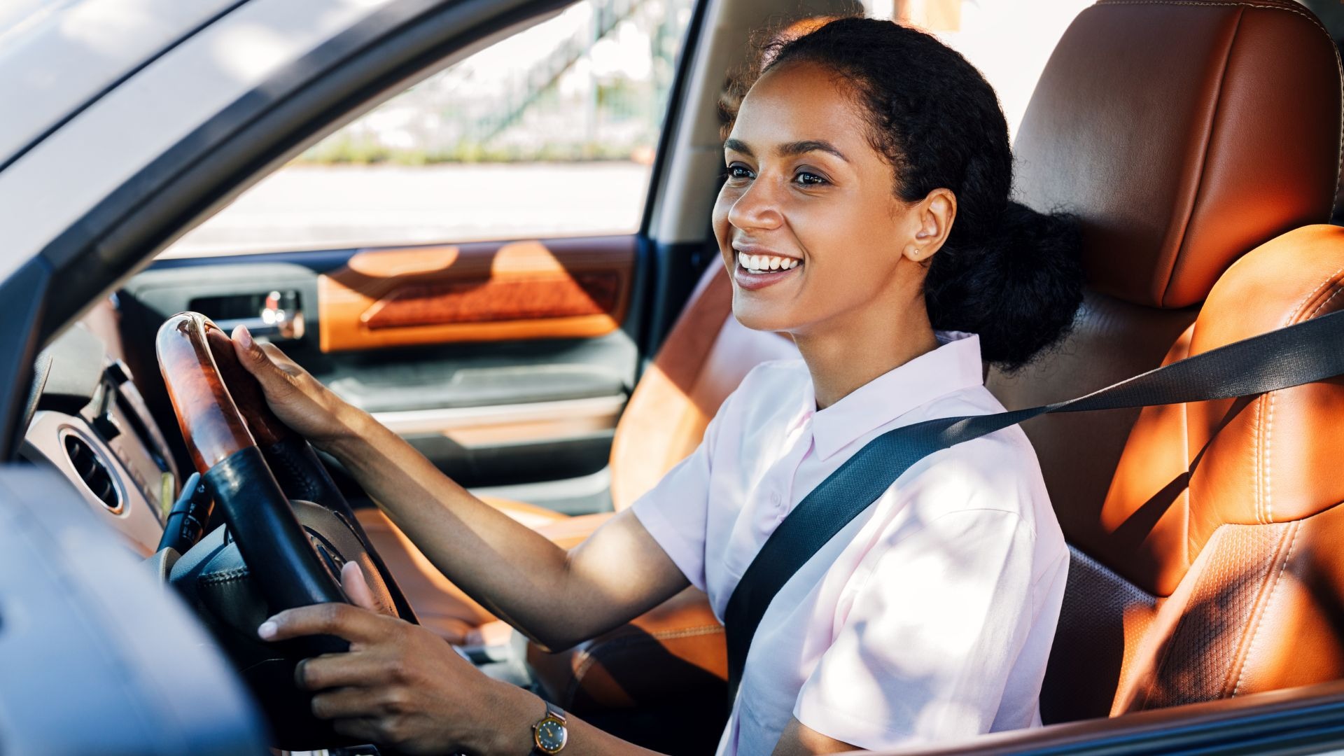
Driver education is not one type of industry that looks forward to change. It is built on tradition, word-of-mouth trust, and personal relationships. Parents want safety. Students want confidence. Instructors want respect and stability. So when NextDoorDriving entered this space with an online learning and booking platform, they knew they were not just selling a service. They were selling trust.
Instead of trying to “disrupt” the industry with loud branding or complicated technology, NextDoorDriving chose a smarter path. They tried to make technology natural, familiar, and supportive. By using smart branding and considerate UX design, they were able to create a digital platform that could be trusted by people.
Understanding a Market That Does Not Like Change
NextDoorDriving recognized early on that driving education is a conservative field for three main reasons. It is all about safety risks, regulations, and human relationships. Students and parents do not want surprises during driving lessons. They want reliability. Instructors do not want to feel like they are being replaced by apps or algorithms. And regulators expect professionalism, documentation, and compliance.
Instead of pushing flashy innovations, the company took a different route. They focused on making their platform feel like an extension of the traditional system. They paid attention to emotional comfort. Their students do not feel stressed before they take a Texas adult drivers ed course. And that made all the difference.
Branding That Felt Familiar
Visual identity became one of the first trust-building tools. NextDoorDriving did not use loud colors, futuristic icons, or overly modern designs that might confuse traditional users. Instead, they selected calm, soft tones that are typically associated with safety and reliability. This visually communicated a message that you are safe here.
With this foundation in place, they could introduce brand values more easily. They emphasized safety, respect for instructors, student confidence, and transparency. All of this positioned NextDoorDriving as a helpful partner. Their messaging did not jump straight into features. They used clear, reassuring language:
- “You learn at your own pace.”
- “Certified local instructors, trusted by real learners.”
- “We work with your schedule, not against it.”
Each line subtly communicated care and reliability. This helped reduce skepticism from new users.
UX Design That Reduced Anxiety
Branding opened the door. However, it is the UX design that makes users stay. The team understood that learning to drive can already be stressful. So, technology should not make it worse. Every part of the platform was built to simplify decisions, reduce confusion, and guide users gently.
First, NextDoorDriving designed the interface to feel familiar. They did not try to reinvent how booking systems work. Pages were structured intuitively, with clear navigation, readable text, and recognizable symbols. Users did not need a tutorial to figure things out. Instead, they immediately felt like, “Okay, I know how to use this.”
They also took into account the emotional process of learners. New students are usually afraid, particularly the moment they are about to take their tests. To help them, the application provided lesson summaries, straightforward progress indicators, and positive remarks. Rather than overwhelming users with data, it focused on clarity and calm guidance.
Instructors were also a major audience. Many driving instructors are independent professionals who prefer personal relationships and direct communication. So, instead of replacing them with automation, the platform supported them with useful tools. They could manage bookings, track student progress, and optimize routes without losing control over their business.
Small Features That Built Big Trust
NextDoorDriving did not try to build credibility on a single large feature. Instead, they went with small, meaningful details that made users feel safe, informed, and respected. As an example, one could see the verification badges of the instructors on the platform, which verified their qualifications and education. This reassured the students and parents who had the desire to ensure they were learning with qualified professionals.
Another fact that had a significant influence was that the profile photos and reviews were real, taken from actual learners. The site used real instructors and learners, as opposed to using generic quotes or stock images. This made the experience appear more authentic as compared to being theatrical or artificial.
Transparency was also an important factor. Users could always see pricing upfront, lesson availability, and cancellation policies. Nothing was hidden behind extra clicks or unclear buttons. To ensure similar transparency with your brand, work with a professional UX design partner.
Trust Before Growth
NextDoorDriving did not grow overnight like a viral app. Their growth was steadier and quieter. But it was also stronger. Parents recommended the platform to other parents. Students who successfully went through their examinations enticed friends to enroll. The teachers who at the beginning were skeptical were turned into staunch supporters after they realized how the work was eased by the platform. NextDoorDriving focused on trust instead of hype. This way, they have built relationships. And in a conservative industry, relationships are everything.
When UX Becomes a Strategic Driver
NextDoorDriving succeeded not because it had the most advanced technology. It understood people. It recognized that in driver education, trust comes before innovation. The company has combined thoughtful branding with anxiety-free UX design to build a digital platform that respects tradition while gently modernizing it. Their journey proves that in cautious markets, technology alone is not enough. Trust is the real driver.
.png "Best Branding Agencies in Toronto (2026)")
%20(1).png "10 Best Web Design Companies in Toronto (2026)")


