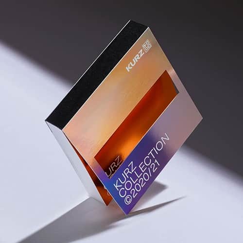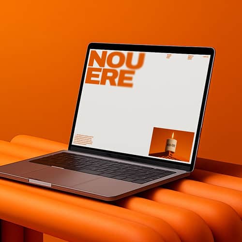
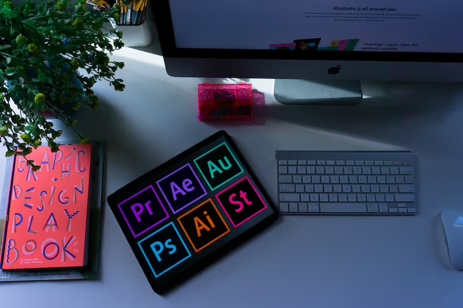
Creating visually appealing graphics does not necessarily require a degree in graphic design. Instead, it requires a solid grasp of the fundamental principles behind effective graphic design. Whether you are creating marketing materials, designing a website, or producing social media content, understanding these basics helps you communicate ideas clearly and keep visual work cohesive. This guide covers five fundamental principles: colour theory, balance, imagery, typography, and composition.
The 5 Fundamentals of Graphic Design
1. Colour Theory
Colour plays a pivotal role in design, influencing how viewers perceive and interact with visuals. Understanding colour theory involves concepts such as contrast, complementary colours, saturation, and the way different hues behave together. Strong contrast can draw attention to specific elements, such as calls to action, and help guide the viewer through a design. Complementary colours, such as yellow and purple or blue and orange, can create clear visual separation and impact.
Colour can also contribute to mood and meaning, but those associations depend on context, culture, category, and the colours around them. Rather than relying on one-size-fits-all colour psychology, use colour deliberately to support hierarchy, reinforce brand messaging, and make important information easier to notice.
2. Balance

Balance is a fundamental principle in graphic design that refers to the distribution of visual elements within a composition. Achieving balance helps prevent one element from overwhelming the rest of the design and creates a more harmonious visual experience. Three common types of balance are symmetrical, asymmetrical, and radial.
Symmetrical balance involves arranging elements evenly around a central axis, resulting in a mirror-like composition. This type of balance can create a sense of stability and order, making it useful for formal or highly structured layouts.
Asymmetrical balance involves distributing elements unevenly across the composition while maintaining visual equilibrium. This approach can create more dynamic designs by balancing contrasting elements such as size, colour, texture, and negative space.
Radial balance revolves around a central focal point, with elements radiating outward in a circular or spiral pattern. This structure can draw the viewer's eye toward the centre while creating a sense of movement and rhythm.
Achieving balance also involves considering visual weight, which is the perceived importance or dominance of elements within the composition. Large objects, bold colours, dense textures, and high-contrast elements often carry more visual weight than smaller or quieter elements. Repetition, alignment, proximity, and spacing can help create cohesion and make the hierarchy easier to understand.
3. Imagery
Images are powerful tools for communication, capable of conveying ideas, context, and emotion quickly. When selecting imagery for a design project, consider image quality, relevance, composition, and how well the visual supports the message. High-quality imagery that fits the audience and subject can make a design clearer and more engaging.
For digital work, graphics should also hold up across different screen sizes. Testing crops, focal points, and legibility on mobile as well as desktop helps maintain a consistent visual experience and supports a stronger user experience across devices. Images featuring people can also add a human element when that choice is relevant to the message.
4. Typography
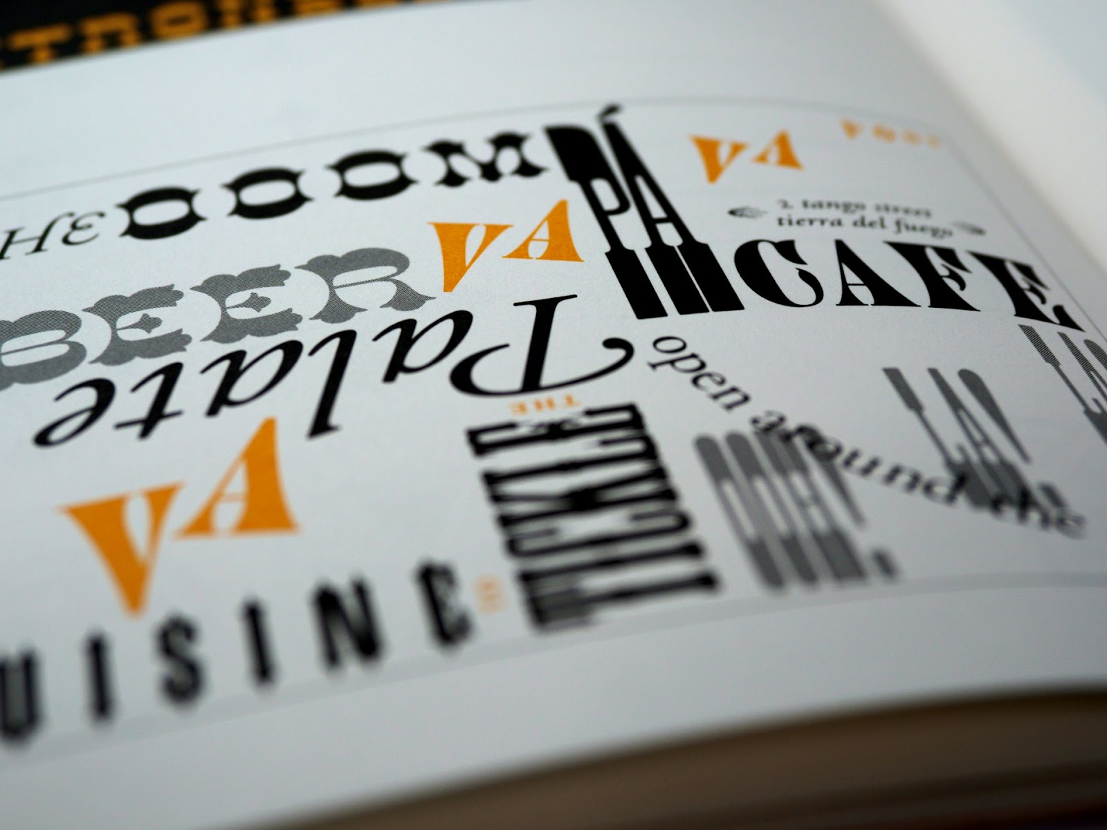
Typography encompasses typeface selection, sizing, spacing, hierarchy, and arrangement, all of which influence readability and brand identity. Choose typefaces that align with the brand's personality while remaining readable in the contexts where they will appear. Limiting the number of type families can help maintain consistency and reduce visual clutter, while thoughtful font pairing can create contrast without sacrificing clarity.
Serif and sans-serif typefaces can both work effectively across print and digital applications. The right choice depends on the audience, size, medium, and broader design system rather than a fixed rule about which category belongs where. Responsive text placement and clear hierarchy also help typography remain legible across screen sizes. For a deeper look at type choices, see Brand Vision's guide to typography and brand perception.
5. Composition
Composition refers to the arrangement of visual elements within a design. It helps guide attention, establish hierarchy, and make information easier to navigate. Simplifying a design by removing unnecessary elements can improve clarity, while whitespace can reduce visual clutter and give important elements room to stand out.
Each element should serve a purpose, whether it directs attention, communicates information, or supports the overall visual system. Grids, alignment, spacing, scale, and contrast can all help organize a composition so it feels intentional and easy to follow.
Putting the Fundamentals Into Practice
Mastering colour theory, balance, imagery, typography, and composition gives designers a practical framework for creating clearer, more cohesive visual work. Whether you are a graphic designer or a marketer creating everyday assets, understanding how these principles work together can strengthen design decisions and support more consistent brand experiences.
If you want help applying these principles across a larger visual system, Brand Vision can support the design work.