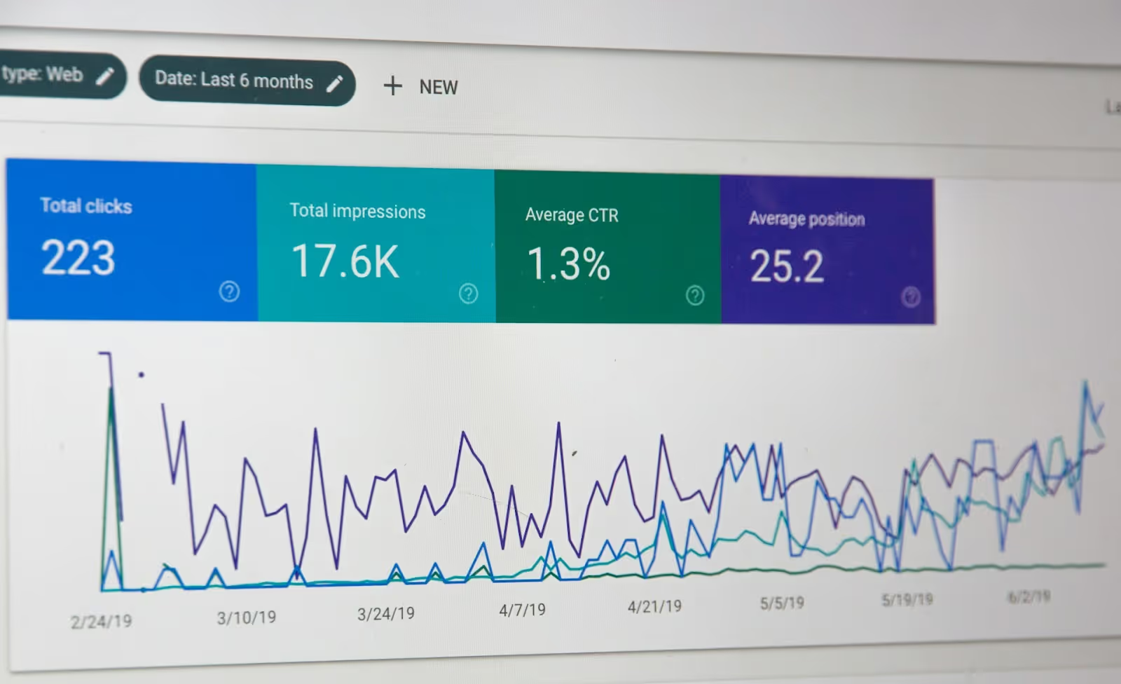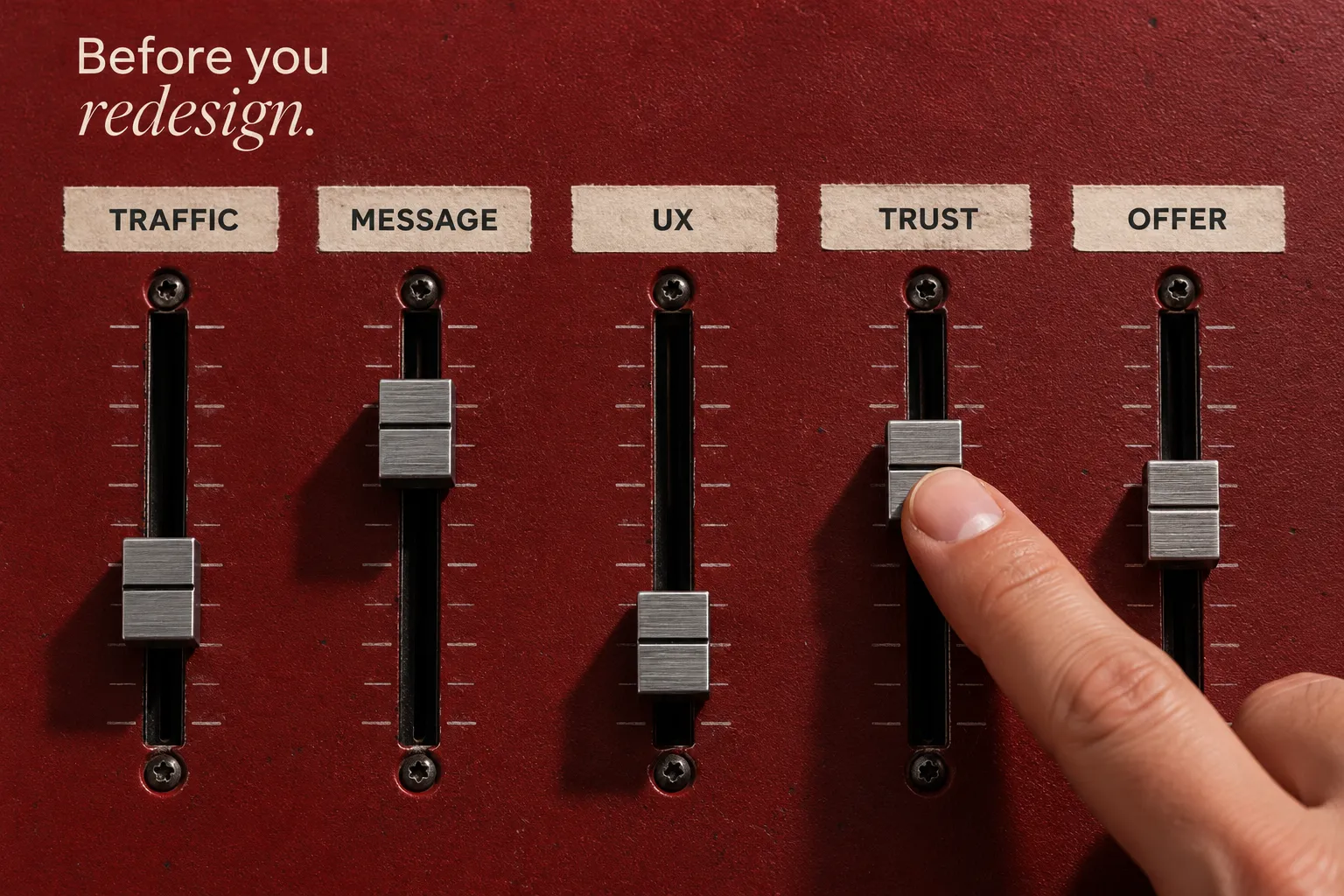
High website traffic can be encouraging, but traffic alone does not guarantee conversions. Getting visitors to your site is only the first step; the next is making it easy for qualified visitors to understand the offer and take the intended action.
A website’s conversion rate is influenced by factors such as trust, usability, traffic relevance, and the clarity of the offer. Improving the percentage of visitors who complete a desired action is the basis of conversion rate optimization (CRO).
The five areas below focus on practical changes you can review when a site is attracting visitors but not enough of them are taking the next step.
1. Add Relevant Social Proof
Social proof can strengthen trust and credibility with potential customers. If your site does not currently show meaningful proof, reviews, testimonials, case studies, and appropriate client references can help visitors evaluate the offer with more confidence.
Examples of social proof to consider include:
- Use real, relevant customer reviews close to the product, service, or decision they support.
- Use case studies to show the customer’s situation, your approach, and the outcome with enough context to make the example useful.
- If you have recognizable client relationships, show names or logos only when the relationship is accurate and you have permission to display them.
The goal is not to fill the page with proof. Use the strongest evidence where visitors are most likely to hesitate, such as near pricing, a form, or the primary call to action. A service case study should address the type of work under consideration, while a product review belongs near the item it describes.
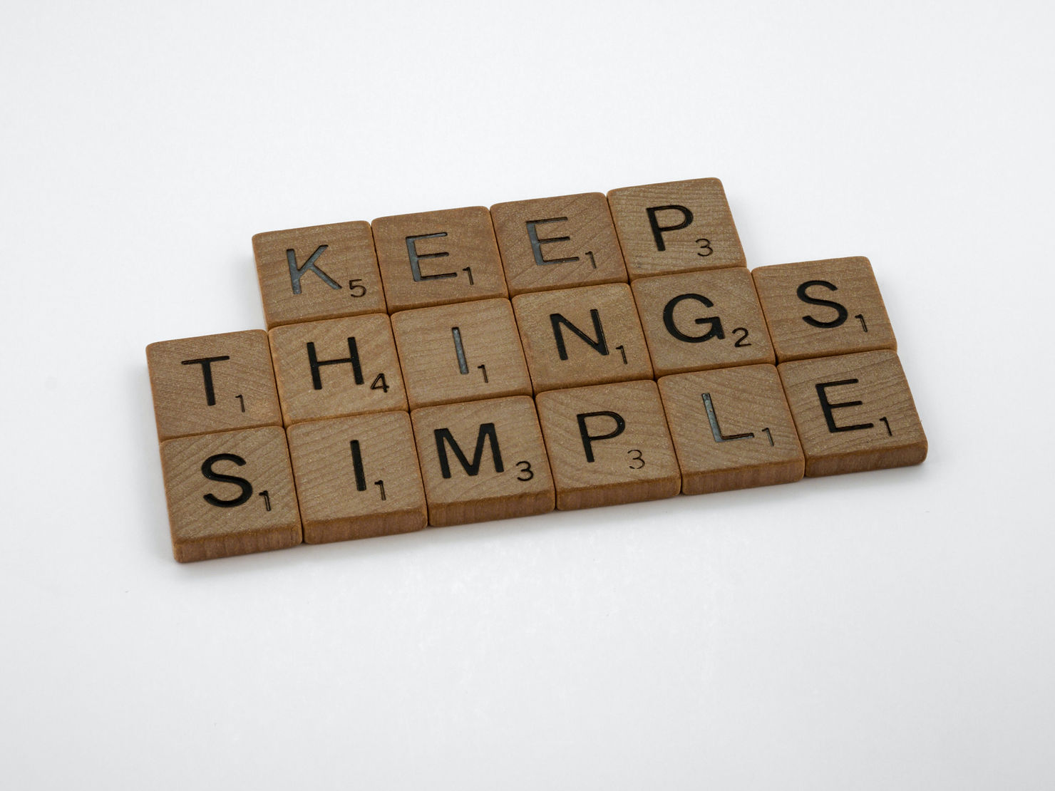
2. Remove Distracting Content
Eliminate unnecessary distractions. When a page presents too many competing messages or actions at once, visitors have to work harder to understand what matters. Keep the experience clear, easy to navigate, and focused on the page’s main purpose.
Review the page from a UI/UX perspective. A visitor should be able to understand what the page is about, what benefit is being offered, and what to do next without searching through the layout.
Landing pages need especially clear direction because they usually support one campaign or conversion goal. Keep the primary action prominent and remove elements that pull attention away from the offer. For a closer look at this approach, see how focused landing pages support conversion performance.
Ways to improve page clarity include:
- Use an engaging, relevant headline that reflects the main outcome.
- Explain the most important benefits and features of the product or service.
- Place reviews or testimonials where they support the decision.
- Use visuals that add useful context to the offer.
- Keep the primary call to action easy to identify.
These details can make the page easier to navigate and the offer easier to understand. The aim is clarity, not minimalism for its own sake. For a more detailed layout checklist, see our landing page design principles.
3. Reduce Purchase Risk
When it fits the business, a money-back guarantee or clear return policy can reduce the perceived risk of buying a product or service online. It can also show that the company stands behind the offer, but only if the promise is realistic and can be honored consistently.
Make the terms easy to find and explain the return window, process, and any reasonable exclusions. If a refund is not appropriate for the type of service you provide, risk reduction can come from clear scopes, timelines, FAQs, demos, trials, or transparent next steps instead. For online purchases, show delivery costs and return conditions before checkout; for service inquiries, explain what happens after the form is submitted.

4. Improve Your Website Copy
Clear, concise website copy is critical to helping visitors make a decision. Your copy should address the customer’s problem, explain the benefits and relevant features of the offer, make the call to action clear, and answer common questions or concerns. Small details matter too: UX writing for forms and buttons should tell people what to expect when they act.
The offer will influence the flow, style, and length of the copy. If you are selling a familiar product that customers already understand, spend less time explaining what the product is and more time showing why your option is relevant or different.
For a high-consideration or less familiar product or service, give visitors enough context to understand the value, process, and potential fit before asking them to act.
The copy should also match the wider brand positioning. If the tone and promises on the page feel disconnected from the rest of the brand experience, the message can become less credible even when the design looks polished. If the audience or promise itself is unclear, revisit the brand strategy before rewriting individual buttons.
5. Test Changes and Measure the Results
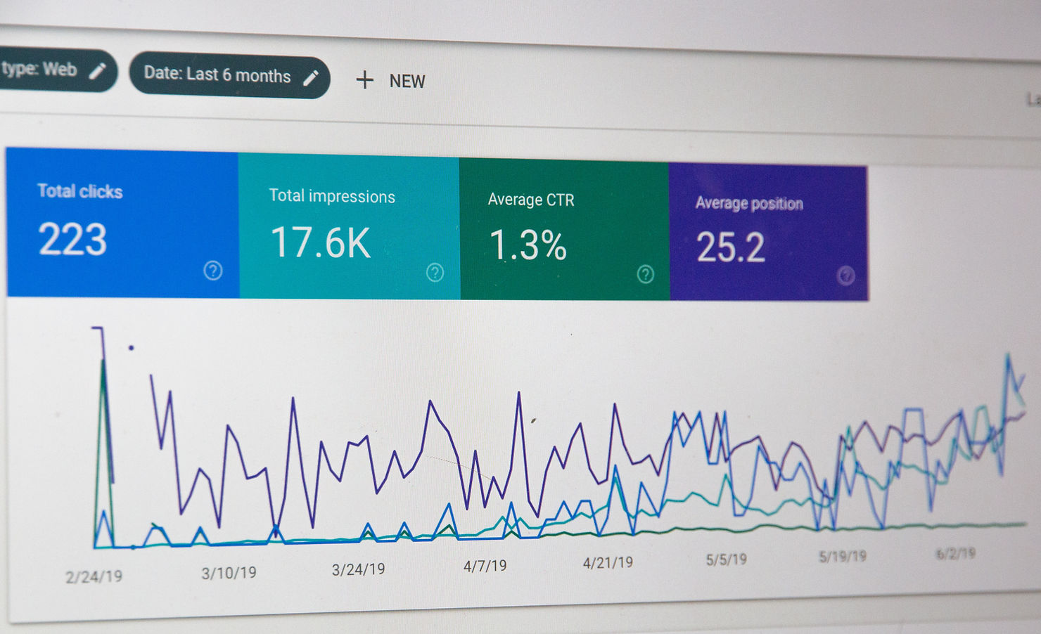
Testing is useful when it starts with a clear question. Consider testing different headlines, calls to action, form structures, or proof placement to see how a focused change affects the conversion event you care about. Start with a defined audience and event, and use website conversion diagnostic checks if you have not yet identified the source of friction.
Possible tests include:
- Headline length, tone, or value proposition
- Call-to-action copy or placement
- Form length or field order
- Review or testimonial placement
- A live-chat option when visitors regularly need help before converting
Measure changes carefully and avoid altering several unrelated elements at once without documenting them. Otherwise, it becomes difficult to understand which decision helped or hurt performance.
If you are not sure where the friction is, combine analytics, customer feedback, and usability research before deciding what to change. A focused UX audit can help identify issues and prioritize the highest-impact opportunities.

Turn Conversion Insights Into Better Website Decisions
Conversion optimization works best as an ongoing process: identify friction, make a focused change, measure what happens, and keep what helps.
If your site attracts the right visitors but the path to action remains unclear, Brand Vision can help assess the customer-facing experience. Explore our web design services or contact our team to discuss a focused next step.